GBC graphic design students learn how to cater designs to clients
Second-year graphic design students at George Brown College (GBC) gathered at the school of design building on Nov. 29 to support each other in the annual poster design show while networking among potential partners.
The proceeds of the posters, which sold for $40 each, help to fund a scholarship available to first-year students in the same program.
The participating students were asked to design their posters in response to client briefings that went over their expectations as far as design was concerned.
The clients were hypothetical restaurant owners starting their businesses in Toronto.
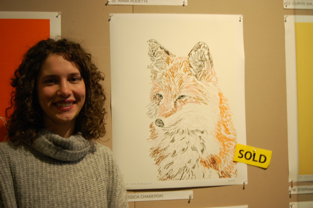
Accessibility was a technical aspect of the design produced by Jessica Chaberski.
Her continuous contour illustration of a fox sold as quick as the animal itself!

Jessica Chaberski with her sold poster. Photo: Timo Cheah / The Dialog
“I love colour, but for someone that’s visually impaired, they might not see certain contrasts,” explained Chaberski.
Particular shades of grey and orange were utilized to accommodate this factor.
There was a truly unique aesthetic to every poster, despite the assignment calling for groups of five students to develop a central theme.
The objective was to help the client “find the best attributes for that niche market they are looking for,” said Joel Kentjanaputra, who was assigned by a client new to Toronto.
Kentjanaputra’s design was to focus in on reflecting the history of the restaurant.
In Joel’s case, the recipient was Cajun, an ethnic group mainly located in Southern Louisiana and the Eastern Maritimes of Canada, with Indigenous, Métis and French heritage.
He decided to design a lobster to align with the restaurant’s staple dish.
Prominent designers were chosen as inspiration for their works.
Kentjanaputra was fascinated by the eclectic nuances of the signature polka dot style of Yayoi Kusama, a Japanese contemporary artist.
“Little circles,” were used, “as a metaphor for my cayenne; to sprinkle on the lobster,” he said.
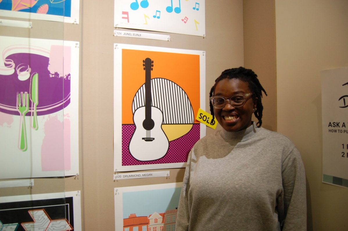
Megan Drummond, who was in Kentjanaputra’s group, incorporated the jazz culture of the restaurant.
Seeing the similarities between these two artists and how they branched out, arrived at an interesting result.
“(Lichtenstein) used a lot of halftone dots, stripes and bold colours in his work,” said Drummond, who designed a guitar in the pop artist’s style.
Six winners were accompanied by two choices of the school’s dean.
The winners were chosen by alumni of the program who are currently working within the industry.
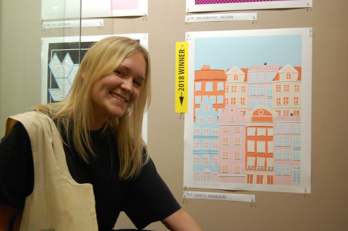
Among them, Madeson Darcy placed for her Scandinavian architecture graphic.

Madeson Darcy with her poster design. Photo: Timo Cheah / The Dialog
The creative process took Darcy on a path full of roadblocks and setbacks.
Luckily Jerri Johnson, a professor at the school of design, was there to guide students during the process.
“Originally they looked like graveyards, (Johnson) said, because they were really small,” said Darcy, on her development of the colourful buildings.
Before submitting, Darcy accentuated the amount of refining that needed to be done once she magnified the composition.
But in the end, the little houses took home the win.


